Vocion 7.6: One face per agent, and a calmer frame
The chrome around the spark caught up: one warm surface, a plain workspace row, quiet app icons, one shape for every menu, and an agent that wears its own colour until it starts working, then blooms into the spark.
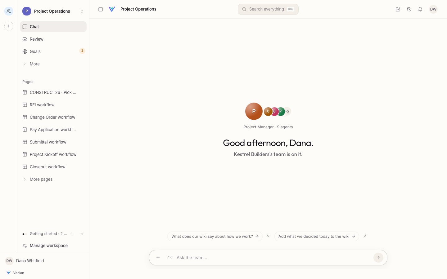
Status: shipped. #1410 in v7.5.0 and #1412 in v7.6.0. No migration and nothing to configure.
The spark gave Vocion one AI colour, shown only while an agent works. This release brings the frame around it up to the same standard, so the spark is the only thing on screen that moves.
One surface
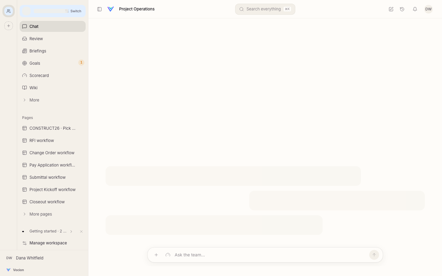
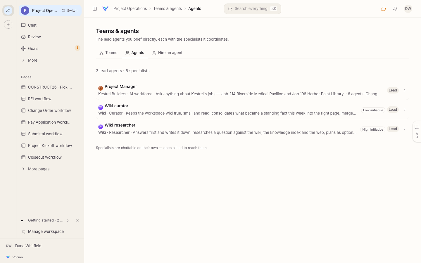
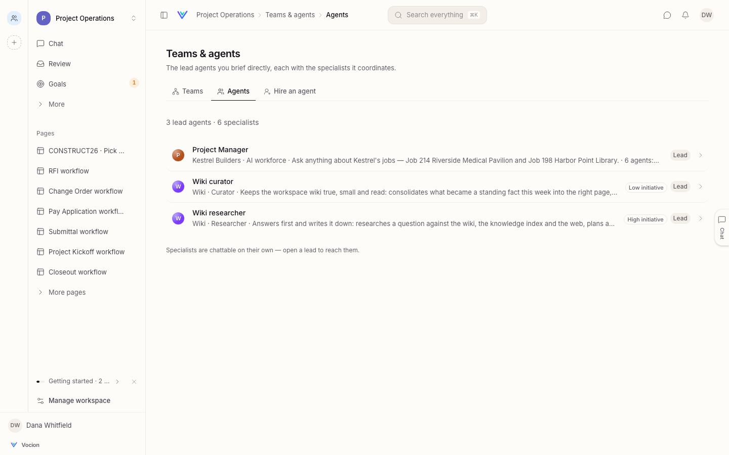
The sidebar is now the page's own warm paper, split from it by a single hairline. The workspace is a plain row with its mark, its name and a chevron; the tinted pill and its "Switch" chip are gone. App icons on the rail are quiet, and only the app you're in wears its colour.
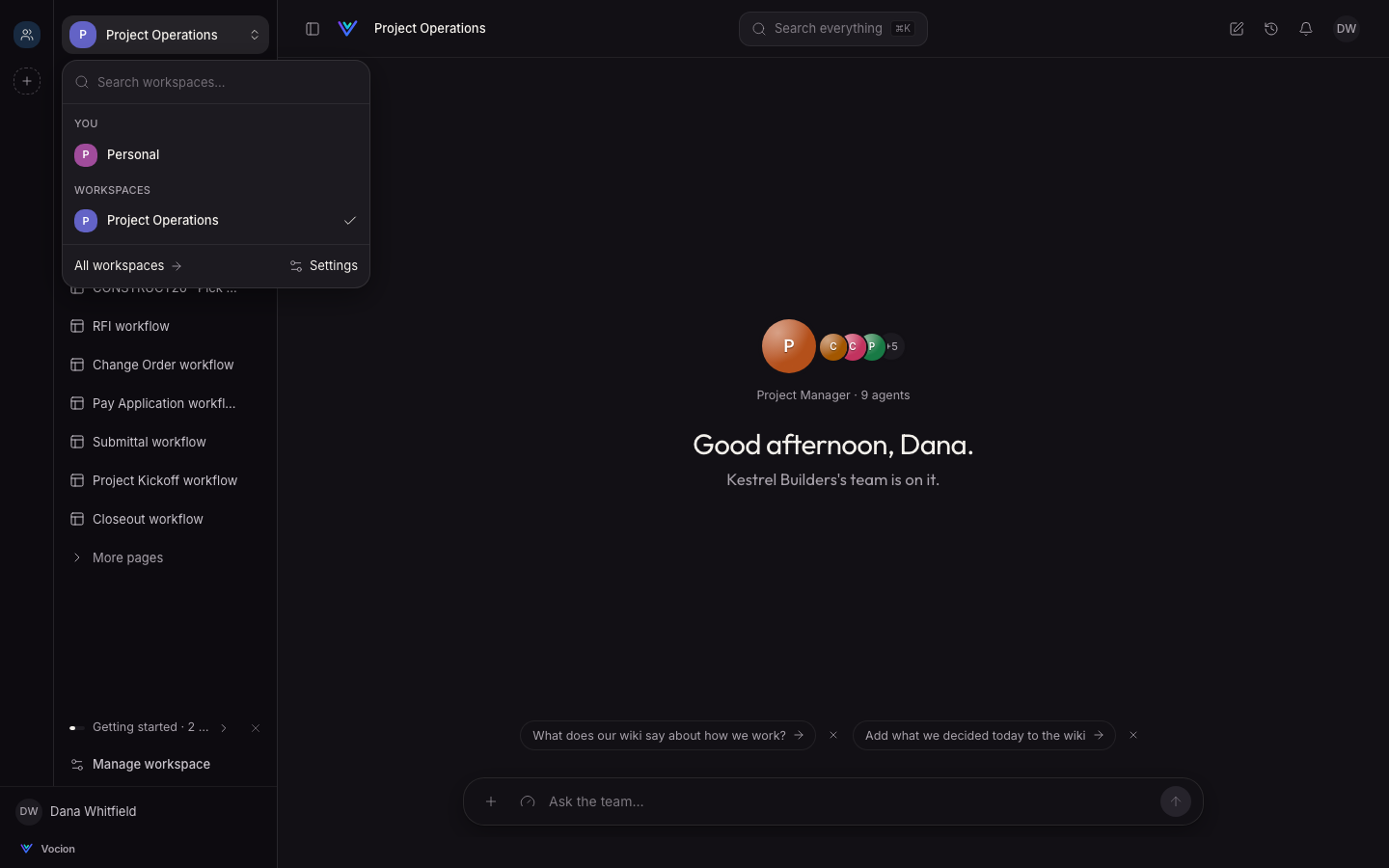
One shape for every menu
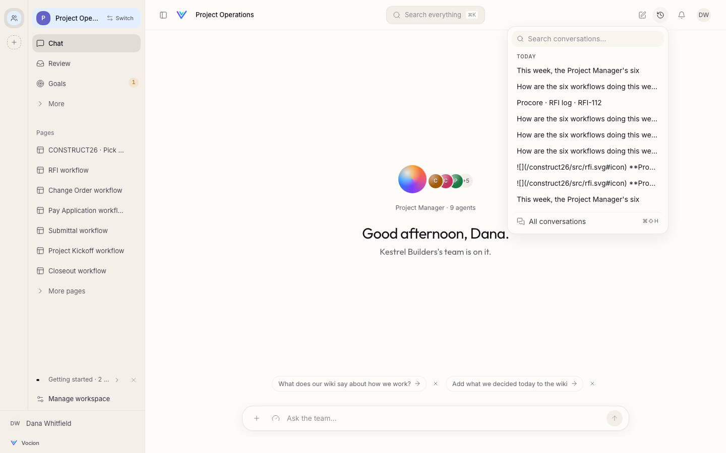
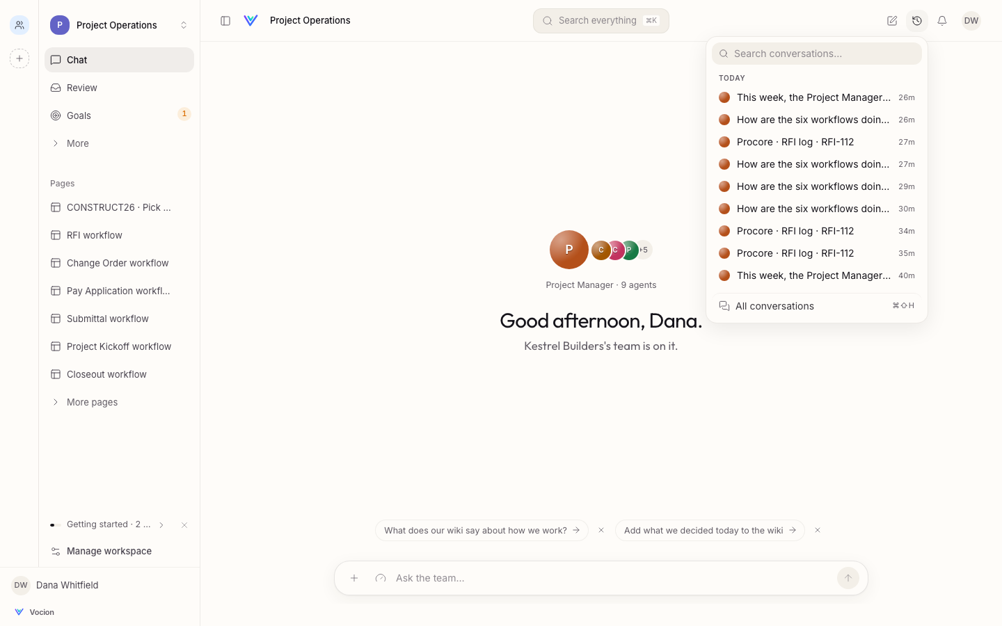
The workspace switcher, chat history, the account menu and every other menu share one surface: rounded corners, one hairline, one soft shadow, and a quiet highlight instead of amber. Chat history now shows who each conversation was with and when, and titles read as words instead of markdown.
One face per agent
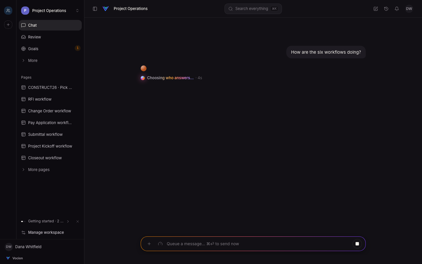
Every agent is drawn the same way everywhere: its own colour as a small lit orb, then its name. That's on a new chat, in the turn, in the agents and teams lists and on its profile. When it starts working, the spark blooms over its colour from the centre. When it's done, the spark settles back into the agent's colour.
A cleaner turn
- The turn's level, model and time sit quietly on the right, and a teammate's role shows on hover.
- Step results read as plain words ("nothing found", "12 threads").
- The record, artifact and source chips after an answer share one shape.
- When an agent says something, calls a tool and speaks again, the two parts are now separate paragraphs instead of one run-on line.
Get it
Update to v7.6.0 or later. Nothing else changes. The design rules behind all of this, in one place, start at vocion-core's docs/design/README.md.